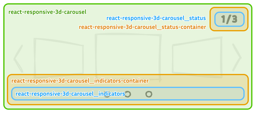
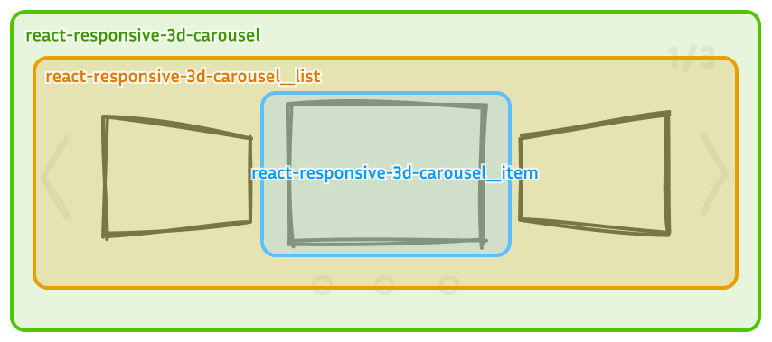
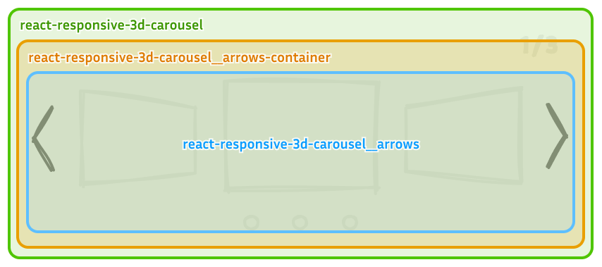
CSS Customization
The carousel is fully customizable, allowing you to override its default CSS styles. To prevent style conflicts, all class names are prefixed with react-responsive-3d-carousel. Refer to the images below for a detailed breakdown of each class name.
Carousel
The following image shows the available class names for customizing the carousel layout and styling.
Arrows
- The
*-containerclass positions the component withposition: absoluteand appliespointer-events: noneto prevent interference with user interactions over carousel items. - Customize each arrow button using the
buttonchild selector.
Status and Indicators
- The
*-containerclasses position the components withposition: absoluteand appliespointer-events: noneto prevent interference with user interactions over carousel items. - Use the
pchild selector to style the status text. - Style the indicators using the
ulandlichild selectors.